I don't claim to be an expert painter, but I have picked up a few tips over the years that work for me. these might be helpful to you when you're painting
Mountains
Needless to say, if you struggle to paint a Mountain, it won't be a very convincing Scottish Landscape. Conveying the sense of scale and the rugged surface can be a challenge. There are two tricks that I employ which seem to work more often than not.
- Distant mountains have a greater blue tinge, and this can help convey distance and scale. This is known as 'atmospheric perspective'.
- The palette knife is an excellent tool for mountains. It also forces me to work quickly and helps avoid over working. I try not to be tempted with a small brush, trying to paint individual rock shapes or cliffs - the eye is an amazing thing and a few scrapes with the knife can work wonders to create the impression of a rugged landscape. Using the knife requires a bit of confidence - and a little luck as well - and it is best used with conviction. Remember if it all goes horribly wrong you can of course just scrape it off again!

These Mountains were largely painted with the knife. Notice the blue tinge as the mountains recede (French Ultramarine and white) - this is perhaps more exaggerated than the eye would naturally see it but I like the effect it gives. The nearer mountain uses more green - this is cadmium yellow and french ultramarine with white, scraped on roughly with the knife. The rocks mix burnt umber, with some brush work in a fat medium to create a little depth. This section was completed in around 3 sittings with the sunny green highlights last on over the week old base.

This is a close up of the Cobbler, and largely the method was as above. I used yellow ochre to mix the green shades rather than cadmium yellow which gives an earthier tone. The heather in the foreground has been painted with Crimson. There is plenty of crimson in the sky also to give a more dramatic effect.

Unlike the examples above, this mountain was brush work only. The core mix is burnt umber and french ultramarine, which I used with no white to create the dark tones. A fine brush was used to pick out the highlights in the mountains, and rocks in the foreground. The mix of blue increases as the rocks recede and a little white is also added - this gives the sense of distance and scale of the mountains in the background. The greens use a yellow ochre and french ultramarine mix.
Skies
A Sky can make a painting, and change the mood of the picture. Sometimes of course, the Sky is the painting! I love painting skies and for me they are the most rewarding part of paintings. Each to their own, but I think skies work best with a limited palate, and a broad brush. I stick to a trusted few colours - cobalt blue is a mainstay for the daytime sky with plenty of white, but Paynes Grey works well for darker and evening skies.
I work clouds freely and quickly using french ultramarine and burnt umber mixed with white to produce the varying shades of 'grey'. A hint of Crimson can help warm the shades of the clouds. I rarely use small brushes or attempt fine detail, except perhaps last minute to pick out bright highlights. This can quickly over work the sky and the energy lost. Dramatic evening or morning skies can make greater use of warm tones such as Alzarin Crimson.
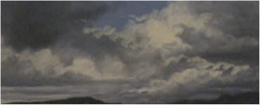
This painting used a mixture of cobalt blue for the sky, and a mixture of french ultramarine and burnt umber with titanium white for the clouds, with a standard medium. The undersides of the cloud are slightly warmed by a touch of Crimson Alizarin - used sparingly. A large brush was used , with its edge used last to pick out the highlights in pure white. This helps create the dramatic light effects. The sky was finished in two separate sittings - I find it easier to finish the white highlights off after the base has a week or so to firm up to avoid any mixing.

This is a gentler spring day sky, with more subtle tones. The colours are essentially the same as above, with greater white pigment added to soften the effect.
Water
Water is a difficult subject, and it's not my strongest subject! I have a few tricks though . The water picks up tones from the sky. Using these will help to connect the composition Again don't try too hard - not every wave and ripple can be painted and so the trick is to suggest enough to create the realism, but with a painterly quality. I use a large soft brush, and smaller brushes to pick up the detail. Also large 'blocks' of colour can work just fine with little detail required. Glazes - where think layers of paint are applied with a 'fat' medium - also work well for the darker tones in calm and reflective waters.

There are essentially three tones here. The deep blue tones are unmixed Paynes Grey, with a fat medium. This has been worked up in several thinner glazes to create the depth of colour. White is added to Paynes Grey to create the middle tone, and the light has been carried down from the clouds which mixed a little cadmium yellow and white. Highlights are picked out against the dark glazes to suggest the gentle waves. Directionally the brush strokes are more or less horizontal. A thinner brush has been used to pick out thinner highlights, and reflections.
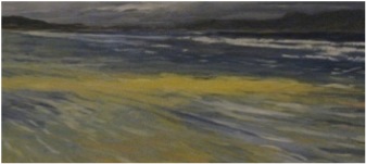
French Ultramarine has been used here, unmixed in the darker stretches of water. This colour is used throughout, mixed with white as the water is shallower. The sun kissed sand is lemon yellow, with yellow ochre also used for the sand in the foreground. The white breakers have been painted in a later sitting.
Buildings
I struggle a little with buildings. The fact is, with mountains and skies, lines are rarely straight. Get the line wrong in a building, though, and the building can look, well, wonky. When I have attempted them - as in the example below - I've found that broad 'suggestion' of detail works better than trying to paint every window and door... this'll quickly get you into a tiz. A brush can be used to lean on to get the vertical line, but the line of the canvas can also be used here as a guide.

I've used white with raw umber for the main colours. A fine brush was used to suggest detail such as pitches on distant roofs, doors, signs and windows... looking closely this is fairly unconvincing but it does work quite well from a distance.
Land and Trees
Greens are one of the most difficult colours to get right. They can sometimes look unconvincing . I don't use ready mixed green - but prefer to mix a blue with a yellow. My preference is Cobalt Blue mixed with cadmium yellow. Lemon Yellow or Yellow ochre can also give nice tones.

This is one example of glazes. The dark areas have been built up from French Ultramarine and Burnt Umber (not black) with a medium that is progressively 'fatter' as the layers progress. There are about 3 or 4 glazes, built up over several days. This gives a real sense of depth and richness to the darks. The green is Cobalt Blue with lemon yellow, and a little french ultramarine is also used for the pale blue highlights.

For this mid ground land mass in the 3 sisters painting I used a knife rather than a brush. The paint was applied thickly and quickly with a mix of cobalt blue and lemon yellow. This part of the picture was painted in about 20 minutes only.